
Visual storytelling helps make sense of Cryptocurrency jargon by turning it into stories that stick. In this article, you'll learn ways to turn blockchain mumbo-jumbo into visual stories people actually remember. You'll pick up tricks to explain everything from smart contracts to DeFi protocols using pictures that click with both newbies and crypto veterans.
The Science of Visual Storytelling in Crypto
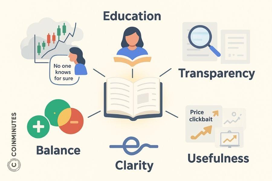
![]()
Visualizing crypto complexity into clear stories
Let's face it - we all grasp pictures way quicker than walls of text. When folks encounter text-only explanations of crypto mechanisms, their brains scramble to picture stuff they've never seen before, and that's mentally exhausting.
Visual storytelling isn't perfect though. Abstract concepts like cryptographic security can lose their technical edge when oversimplified. Plus, making decent visuals eats up time and requires some design chops. Tech-savvy readers might find visuals alone too lightweight without the nerdy details. My solution? Layer it up - hook people with visuals first, then pile on the technical meat for the geeks who crave it.
Core Visual Storytelling Frameworks for Crypto
The Concept Breakdown Approach
To break crypto concepts into visuals that make sense, I've found it helps to have a game plan. Start with how regular people use the thing, not the technical backend stuff. This flip in perspective completely changes how you'll think about blockchain.
Here's my go-to process for making sense of any crypto concept:
- Figure out what it actually does for users
- Pick out the main parts (stick to 5-7 or you'll lose people)
- Show how these parts connect
- Come up with visual metaphors for each piece
- Stitch it all together into a coherent story
Comparison Grids That Work
Crypto's crawling with competing tech. Visual comparison grids help people spot differences without getting lost in the weeds.
When we tackled Layer 1 vs. Layer 2 solutions, we went with a highway comparison. The top row had main blockchains getting jammed with traffic, while the bottom showed express lanes handling the overflow. We stuck metrics on signposts. Super simple, but it clicked better than we thought it would.
For your own comparisons:
- Stick to 3-4 key differences
- Keep your metaphors consistent
- Use colors to make things pop
Process Journey Maps
Cryptocurrency Market involves weird multi-step processes that make people's eyes glaze over when written out. Journey maps transform this slog into a visual path people can follow.
I've seen folks mess these up by:
- Cramming in too many steps (keep it to 5-7 main stops)
- Missing the forks in the road where things branch off
- Drawing straight lines for processes that zigzag in real life
- Skipping the "how long" and "how much" info people actually care about
Visual Analogies That Stick
The crypto explanations people remember best connect weird blockchain stuff to everyday things they already understand.
To cook up useful analogies:
- Nail down what you're actually trying to explain
- Brainstorm everyday processes that work similarly
- Check if your analogy holds up in edge cases
- Show both the familiar thing and crypto concept side-by-side
- Be upfront about where your analogy breaks down
Implementation Resources and Skill Development
Resources and Workflow Reality Check
You don't need fancy designers or fat budgets to tell visual stories. Use what you've got.

From sketches to meaningful stories
For the broke and resourceful, free tools like Canva, Google Drawings, or even PowerPoint can work wonders. Grab stock photos from Unsplash or Pexels. Heck, I've seen hand-drawn napkin sketches photographed with phones that worked perfectly. Got some cash? Maybe try Adobe Creative Cloud subscriptions or hire freelancers for one-off projects. Bigger companies might bring in full-time designers or agencies, but throwing money at the problem doesn't guarantee better results.
We let data guide our priorities. Digging into our Q4 2023 numbers, we noticed people spent three times longer on DeFi explanation pages than basic crypto pages. That's why we poured more design hours into visualizing yield farming mechanics, even though they were a pain to design.
Picked For You:
CoinMinutes' Vision for Interactive Crypto Learning Experiences
How CoinMinutes Maintains Consistent Crypto User Experience
Building Skills Without Losing Your Mind
Don't sweat it if your first attempts look mediocre. Mine sure did.
From what I've seen, most people go through three phases:
- The Collector Phase (1-2 weeks)
Scoop up good examples from all over the crypto world. Figure out why they work and how you might steal - I mean borrow - their approach. - The Copycat Phase (2-4 weeks)
Take existing templates and tweak them for your crypto topics. Focus on being clear, not clever. - The Creator Phase (1-3 months)
Start crafting your own visual frameworks. Test them on real people and polish based on their confused looks.
You'll need to get decent at matching metaphors to concepts, creating visual hierarchy, and basic design stuff like contrast and alignment. If you're just starting out, grab "The Back of the Napkin" by Dan Roam - it's a lifesaver.
Whatever you make needs a reality check with actual humans. Our testing approach isn't rocket science. We literally grab random coworkers who don't know crypto and ask them what they think they're looking at. Our process is pretty straightforward:
- Make a visual
- Show it to 3-5 people who don't speak crypto
- Have them explain it back to you
- Note where they get confused or lost
- Fix it and try again
When we overhauled our staking visualization after some brutal feedback, guide completion jumped up, and support tickets about staking dropped by a third. Not every fix works so well though. Sometimes we actually make things worse before making them better.
Cross-Platform Strategy and Future Directions
Your visuals need to work across platforms without losing their soul. We've built what we call our "visual language library" - consistent imagery and elements that translate from one platform to another. Our blockchain visualization shrinks from detailed website infographics to quick Twitter hits without losing its essence.
Coinminutes Crypto stumbled onto this approach out of pure desperation. Back in early 2023, we were making completely different visuals for each platform and burning out fast. Now we design with flexibility from the start, creating modular visual pieces that work on their own, designing for various screen sizes, keeping colors consistent across the board, and making both landscape and portrait versions. Pro tip: always check on real devices. Stuff that looks perfect in design view often falls apart on actual phones.
What's coming next? I'm betting on more immersive and personalized experiences. AR apps are already letting people "walk through" blockchain processes. Data viz tools are creating custom graphics based on what users already know. I think we'll see more tools that adapt to how you personally learn best.