
Ever hit a website and felt compelled to click “add to cart” or “learn more”? That’s color doing its magic. Colors aren’t just eye candy—they influence emotions, guide actions, and keep visitors glued. For businesses aiming for conversions, mastering your palette is a blend of psychology and art. Here’s how to get it right.
Color Theory 101
Color theory is your guide to pairing hues that pop. It’s the backbone of visuals that grab attention. The basics:
- Primary colors (red, blue, yellow) lay the foundation.
- Secondary colors (green, orange, purple) mix those primaries.
- Complementary colors (like blue and orange) sit across the color wheel for striking contrast.
But don’t play it too safe. Premier web design services remix these basics to match a brand’s vibe. A quirky café might rock mustard yellow and slate grey, while a tech firm leans on electric blue and black. It’s about blending tradition with trends, like soft ombré effects or bold single-color designs.
The Power of Color Psychology
Colors hit you fast. Red shouts “sale!”—perfect for urgency. Blue feels reliable, a staple for finance brands. Green evokes eco-vibes or progress. But context flips the script.
Pink might shine for a cosmetics CTA, but it’s off for a law firm, where deep grey or maroon feels right. Your audience and product shape the palette. This is why web design services are game-changers—they nail the details. Studies show 90% of first impressions about products come from color, making audience-aligned hues essential.
A savvy website designer asks: What’s the user’s next move? Then they choose colors that nudge subtly. Think vibrant greens and whites for health apps to feel fresh, or dark themes with fiery red accents for gaming sites to scream “energy.”
Crafting Palettes That Win
Want users converting like it’s Black Friday? Your palette needs clarity and purpose. Start with:
- 60% primary color: Your brand’s anchor shade.
- 30% supporting hue: Adds richness (like cream with navy).
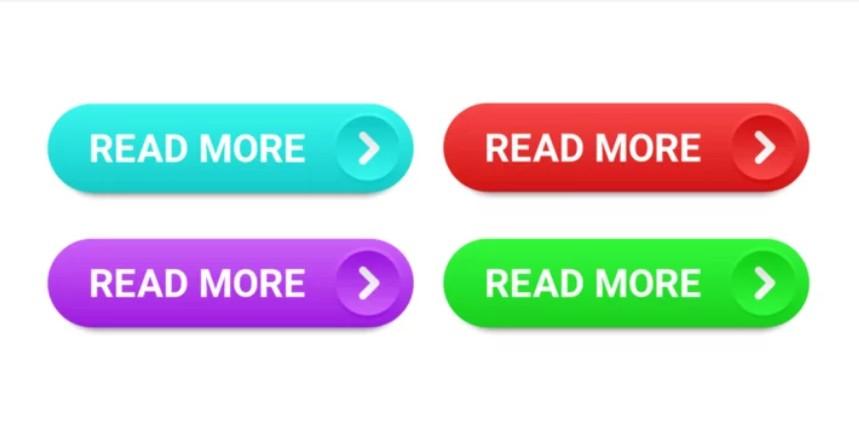
- 10% accent color: For CTAs—bright but not garish.
Apps like Canva or Coolors make palette-building easy, but human insight makes it sing. AI can toss out combos, but it doesn’t vibe with your audience like a pro website designer does.
Contrast is critical. Light grey on white? A readability nightmare. Use WebAIM’s Contrast Checker for legibility. Accessibility is a must—4% of people have color vision deficiencies, so use patterns (like checks versus stripes) when hues are similar in visuals like infographics.
Proof in Action
Real-world wins:
- E-commerce: ASOS’s orange buttons leap off clean white, driving clicks.
- Fitness: Bright reds and yellows in workout apps feel energizing.
- SaaS: Dark backgrounds with teal accents scream “innovative.”
Web design services back this with data. A/B testing showed a button color change from green to yellow lifted conversions by 18%. Tiny shifts, huge gains.
The Human Factor
Design tools flood the market, promising flawless results. But killer palettes come from storytelling. A website designer unpacks your brand’s heart, then weaves it into visuals that resonate. AI can draft a design, but humans bring the feeling.
Still, pros use tech wisely. Tools catch accessibility issues or scan rival palettes for unique spins. Merge tech’s speed with human creativity, and you’re golden. Designers often present a few palette options, explaining how each ties to your mission before finalizing.
Key Takeaway
Ditch generic designs. Smart color choices turn visitors into customers. Invest in web design services or, if going solo, keep it simple: Max contrast, tight palettes, and hues that evoke the right vibe.
Your site’s colors aren’t decor—they’re your stealth pitch. Make them count.