
E-commerce has matured quickly, yet one characteristic remains steady: the first thing a buyer touches is the box itself. The carton does more than shield goods; it announces the seller and, with a little creativity, opens an invitation to show-and-tell on social media. Picture a candy pink sleeve for a one-off launch or a matte-black wrap for something sleek and mysterious. Designers juggle color, grain, weight, and opening gesture, often without realizing they are drafting the brands second logo. Useful yet beautiful packaging is not an extra cost; for many people it is the only second glance the firm will ever get.
Understand Your Target Audience Before You Design
Timing does matter, and so does the crowd waiting on the curb with open hands. Before a single graphic is drafted, someone ought to ask who that crowd really is. Are they the sort who collage their laptops with neon stickers, or do they keep everything sleek and monochrome? Perhaps they measure a brands worth by its carbon footprint. The answers will nudge creative choices along every axis, from paper stock to closure flap.
A college art student might flip for a pink mailer box jammed with doodles, while a finance exec probably wants something quiet-black, maybe, kissed with a whisper of foil. Neither design is wrong, but each would feel distinctly off if swapped. Age, income, leisure habits, and even the moment a consumer clicks checkout all loop back into the visual brief.
Luxury moisturizers and farmer-made soaps tell different stories, so their cartons ought to, too. One brand celebrates indulgent textures and cues of artisanal grandeur; the other leans on earthy fibers and a promise to tread lightly on the planet. When those values seep into the form itself, the sleeve or tuck-top ceases to be mere transit gear. It transforms into a handshake, a nod, or even that last wink that brings someone back for round two.
Choose Colors That Reflect Brand Identity and Emotion
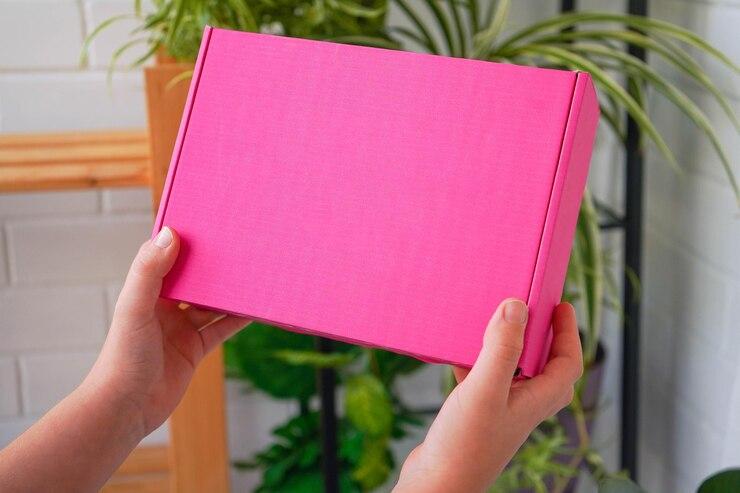
Colors are seldom mere decoration; they form an early, silent dialogue with the people who unpack a shipment. A pink mailer box arrives like a quick wink, signaling liveliness and creative spirit many beauty or lifestyle labels crave. In contrast, a black mailer box steps forward with understated grace, hinting at luxury, technology, or curated subscription service confidentiality. Both instances share the same function-store inside and the worry-free exchange that follows-yet the colors craft entirely different first chapters.
Emotional science backs that instinct, suggesting pinks radiate warmth, approachability, and a hint of youthful mischief. Designers aiming for playful or distinctly feminine appeals stumble less frequently when pink is involved. Blacks, on the opposite spectrum, murmur exclusivity, timeless power, and a whisper of enigma. Analysts who wish to exude bold sophistication often rely on maximum black, forgoing secondary tones to let the hue shoulder the entire message.
Uniformity across touchpoints secures a trusted impression. If a company displays magenta accents on its digital storefront yet ships purchases in candy-floss pink one week and cerise the next, customers waste brain cycles sorting out the riddle. Repeated, matching colors etch brand outlines into short-term memory, sparing the consumer the hassle of relearning each time they see an ad. Whether one commits to a pink mailer box or a satin-finish black, the visual choice should narrate the same story at every digital click and tactile brush.
Focus on Print Finishes and Texture for a Premium Feel
In packaging design, appearance and texture are inseparable. The surface of a mailer box can raise or lower the audiences immediate judgment of its contents. A velvety soft-touch coating on an ebony package whispers luxury, while a gloss or satin exterior in blush pink shouts confidence and exuberance. Techniques such as blind embossing, metallized foil stamping, or selective UV gloss introduce discrete reliefs that beg to be stroked and admired-long after the product has been removed.
Premium merchandise naturally attracts equally high expectations for its encasement. Every deliberate texture-choice silently claims-managements attention to craftsmanship. Consider the understated elegance of a black mailer box shell paired with gilded foil sign-off, or the spirited pop delivered by hydraulic raised UV letters on fuchsia stock. Such refinements cultivate favorable associations in the consumers mind and frequently prompt follow-up purchases or impromptu endorsements to friends.
Well-crafted packaging elevates a product long before it is ever touched. Shoppers intuitively relate refined surfaces to higher quality. That fleeting glance may tip their judgment toward premium in the split-second that counts. Tiny touchpoints like foil stamping or a satisfying snap-hinge lid reinforce that fleeting impression and linger in memory.
Use Custom Inserts and Messaging for an Engaging Unboxing
The spectacle of opening the box, however, extends far beyond the visible shell. An interior worthy of display invites reluctant hands to slow down and savor the reveal. Layers of branded tissue, a handwritten card, and snug custom foam turn plain cardboard into a ritual moment. Imagine a pink mailer box resting on a desk; its cheerful lining begs to be unfolded. Contrast that with basalt-black Kraft inked in glare-cut white, where order and professionalism steal the show.
Designers can fold user instructions, launch teasers, or snippets of origin lore directly into those foam-cut recesses. The unexpected story transforms a call-to-action into a shared anecdote-personal and product in the same breath. Cleverly shaped boards also keep delicate glass or circuitry anchored, shielding them from the unsteady bumps of shipment while silently wowing the customer.
Personalization adds a memorable flourish to the unboxing ritual. Simple touches, such as printing the recipients name or including a handwritten note, signal that the sender has invested genuine thought. Witty doodles or location-specific artwork turn an ordinary carton into an instant keepsake. Customers tend to recall the brand long after the product itself has been put away.
Prioritize Structure and Durability Without Sacrificing Style
Structure and durability remain non-negotiable, even in the chase for aesthetic appeal. A single dent can sabotage an otherwise stunning design and compromise the merchandise inside. High-quality corrugated board is the industry baseline, regardless of whether the box is candy pink or black mailer box. Heavy or fragile goods mandate extra safeguards. Die-cut styles that wedge shut can resist spontaneous openings while they bounce through sorting hubs. Reinforced flaps and self-locking tabs help the package maintain its square profile from warehouse to doorstep.
Durability is often treated as the opposite of flair, yet recent developments in the packaging sector prove otherwise. Sophisticated printing methods now let manufacturers coat corrugated cartons in exacting full-color images, dazzling metallic sheens, and even next-generation bio-based lacquers. A baby-blush pink or a deep-matte black stock can be every bit as resilient as it is eye-catching. When designers pair stout board grades with purposeful graphic layouts, the unboxing moment suddenly feels upscale, almost celebratory.